Description
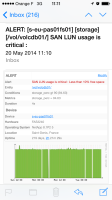
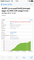
On emails send by custom alerts, the scales are not always shown, making the graphics unuseable and unreadable.
Here is attached an example of correct and wrong graph.
I think we shoud always show at least the top and bottom values shown on the graph

