Details
-
Improvement
-
Resolution: Fixed
-
Trivial
-
None
-
None
Description
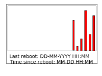
I think it would be better if the uptimegraphs were shown in colums instead of lines as it is now.
If it is possible, the last column should grow as the uptime expands. And each time there is a restart, the graph starts with a new column.
I have made an ugly ilustration to show what it might look like in the attachments.
Maby it could combine column and line in a smart way?
