Details
-
Improvement
-
Resolution: Unresolved
-
Minor
-
None
-
Professional Edition
Description
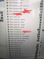
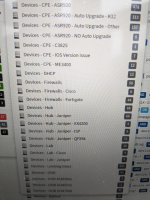
We have an extensive amount of groups of both Ports and Devices. Because of what appears to be HTML limitations, the dropdown menu of this gets cut off at the bottom of the browser window.
We currently have 48 port groups and 35 device groups.
The only way to see more is to in-browser shrink font ("ctrl + -" usually).
Proposing two types of 'fixes'for this, although unsure if eitehr is possible with whatever web toolkit is being used
1) sub-groups, we have some 'top level' things like 'cache' 'peering', 'customer', 'transit'. then each of these have sub groups like 'customer -1g' , 'customer - 10g' OR 'cache - akamai', 'cache - google' and so on. If it could 'pop out to the right' another level for these sub groups that would fix the problem. If it could auto aggregate based on the prefix of the port name, that would be ideal, it would just automatically happen.
2) scrollable menu - simply have some built in scrollbar to the dropdown menu where you can scroll down when it's cut off. Not a huge fan of this solution but hey it's something that some people do.
How do others solve this?

